Branding

Factory Shoppers Club, a leading purveyor of European footwear, approached us with an ambitious project - an all-encompassing rebrand. This brand, renowned for introducing high-grade European shoes to stores across the U.S., craved a fresh, unique aesthetic that would echo their Mediterranean heritage.
The goal extended beyond simply boosting aesthetic attractiveness; it was about crafting a compelling brand story that mirrored their origins, enchanted customers, and set them apart in a crowded marketplace.

The primary problem with their original logo was its lack of uniqueness! For a B2B company like them, it's vital to make a lasting impression at trade shows and expos, and to be instantly recognizable.
They also struggled with a troublesome color scheme that was both hard to read and presented challenges in terms of print compatibility.
Their branding toolkit was additionally restricted by the presence of only one logo variation, which hampered scalability and versatility across different formats and platform


Design
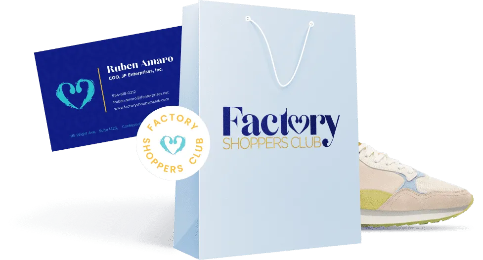
A radiant logo that reflects the style and sophistication of the brand's offerings. It maintains the iconic heart symbol, but transforms it into a more modern and artistic form that truly captures the eye. The choice of two fonts combines contemporary aesthetics with timeless elegance.
This is not just a logo; it's a bold statement about who they are.
Functionality
A functional logo characterized by several key attributes, including simplicity, versatility, distinctiveness, relevance to the brand story, scalability, and readiness for use across different mediums.
Branding Suite
A branding suite is a comprehensive set of elements crafted to establish a consistent and recognizable brand identity across various customer touchpoints.
It includes logo variations, a defined color palette, specific typography, brand-related imagery, and brand guidelines. These components ensure consistency in communication and visual representation, reinforcing the brand's identity in all contexts.
Now, their logo is not only scalable and print compatible, but also visually appealing - aligning seamlessly with their promise to deliver the perfect fusion of style, quality, and masterful craftsmanship!


In the spirit of this transformative rebranding, we've also developed complimentary deliverables and applications that harmonize with the fresh style and visuals.
These include an eye-catching business card and a sleek folder designed for media kits, sales sheets, and other vital documents.
These will serve as our brand ambassadors at trade shows and events, making a lasting impression.

Having different logo variations is essential for a brand's adaptability and versatility across various platforms and uses. Logo variations cater to different platform specifications, application needs, and screen sizes while maintaining brand consistency and visual hierarchy.

Abbreviation

Icon

Stamp

